Minerva
I designed and structured the user experience for Minerva, a Business Intelligence dashboard that helped financial institutions turn complex banking data into actionable insights. By collaborating with data analysts and engineering teams, I organized messy datasets into a clear interface, developed scalable design components, and conducted usability testing to improve navigation. The result: a 25% boost in task completion rates and a 20% increase in online banking adoption.
TEAM
WORK DONE
Research, Data Synthesis, Wireframing, Prototyping, Dashboarding, Data Visualization
⚠️ Challenge
Banks had access to huge amounts of raw customer data, but struggled to interpret it due to:
No centralized view: Metrics were scattered across channels and tools
Duplicate and unclear data: Some data made no sense, some was duplicated, some was unused
Poor usability: There was no existing structure, flow, or visual hierarchy
Lack of UX foundation: I was brought in early to build the experience from zero—no framework, no categories, no prior designs
The most difficult part was starting from scratch. Every metric had to be validated, named, categorized, and placed within a structure that told a story. The dashboard had to accommodate both quick overviews and deep dives, all while maintaining usability and clarity.
🛠️ Approach
Metric Discovery & Collaboration
I spent two weeks working closely with the Chief Data Analyst and engineering teams to:
Audit all current data sources
Identify which metrics were valuable and which needed clarification
Propose new metrics that banking teams would find useful
Wireframes, Prototypes & Testing
Prototyped flows using Figma
Ran usability tests with 5 internal banking teams
Iterated on component layout, chart interactions, and navigation patterns
Built reusable cards, filters, and responsive layout templates
Narrative-Driven Structure
We structured the experience vertically:
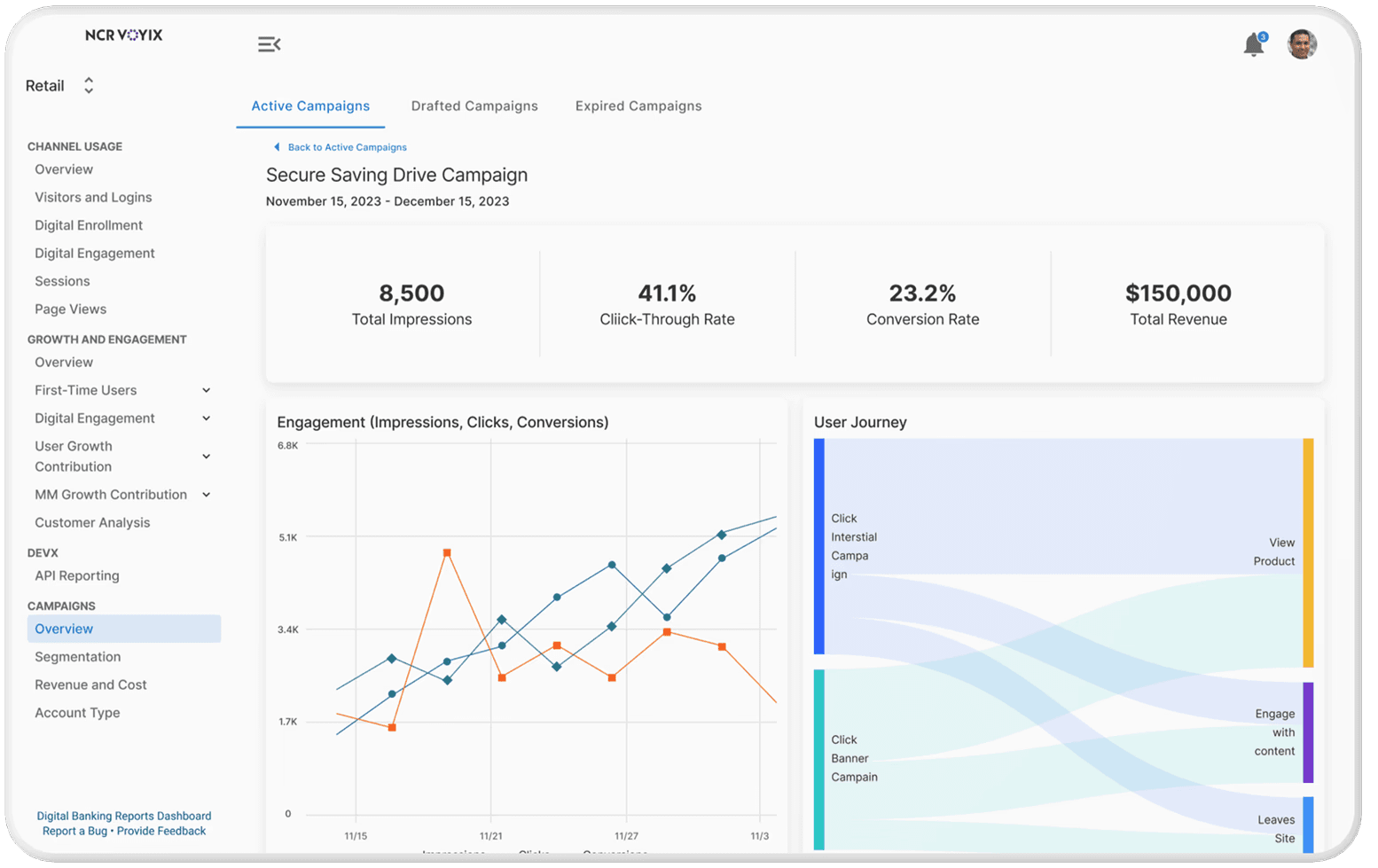
🧩 Top: Executive summary with KPIs
📊 Middle: Trend breakdowns by customer segment, channel, and behavior
🔍 Bottom: In-depth metrics for technical and marketing teams
This structure supported decision-making across roles, from high-level leadership to hands-on analysts.
Categorizing Data into Logical Groups
With over 50+ metrics, we created clusters:
Digital engagement
Channel activity
Campaign performance
Conversion trends
API usage

🚀 Impact
Post Implementation enhancements
✅ 20% increase in online banking adoption, as banks leveraged insights to refine digital strategies.
✅ 15% improvement in promotional engagement tracking, helping banks measure campaign effectiveness.
✅ 40% faster navigation, reducing time spent searching for relevant data.
Following the initial launch, I continued iterating on the product by introducing:
Customer segments dashboard
DevX API usage dashboard
Active campaigns dashboard
Outcomes include:
✅ Transformed raw banking data into a structured, user-friendly dashboard.
✅ Improved usability, increasing task completion rates by 25%.
✅ Increased engagement with digital banking, boosting adoption by 20%.
✅ Established a scalable design framework, allowing for continued feature expansion